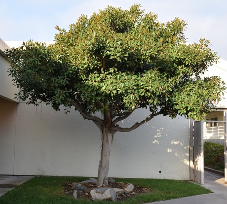
 Balance. ISO 400, Aperture f/8, Shutter Speed 1/400. Balance. ISO 400, Aperture f/8, Shutter Speed 1/400. This photo is of a tree located by our main office. There is balance within the bottom of the tree, where there are rocks located. What makes this photo successful is the fact that the photo is not perfectly proportioned or balanced, but it gives the effect in a way. 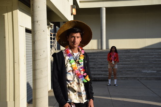 Proportion. ISO 400, Aperture f/8, Shutter Speed 1/1250. Proportion. ISO 400, Aperture f/8, Shutter Speed 1/1250. This photo is of my classmates, Angel and Lorena. I chose this photo for proportion because the positions and locations make them seem very different in size. Angel looks very big and Lorena looks very small due to the contrast in locations and the effect of the shadows. 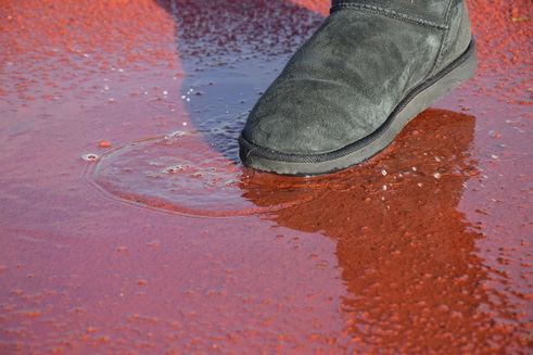 Rhythm. ISO 400, Aperture f/8, Shutter Speed 1/400. Rhythm. ISO 400, Aperture f/8, Shutter Speed 1/400. Rhythm shows movement in a photo. This is a photo of my partner tapping her boot in a small, shallow puddle. What makes this photo successful is the evident movement occurring in the water. 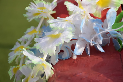 Emphasis. ISO 400, Aperture f/8, Shutter Speed 1/1000. Emphasis. ISO 400, Aperture f/8, Shutter Speed 1/1000. This is a photo of a lei on a tackle dummy on the football field in the stadium. It emphasizes the analogous colors of the lei. What makes this photo successful is the contrast between the dark, harsh maroon color and the light green, light blue, and white. 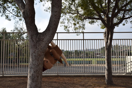 Variety. ISO 400, Aperture f/8, Shutter Speed 1/1000. Variety. ISO 400, Aperture f/8, Shutter Speed 1/1000. This photo represents variety. It was taken in the quad, in the dirt area. It integrates many of the principles into the photo. What makes this photo successful is the diversity in it. 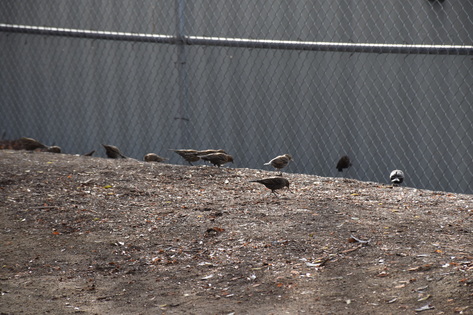 Harmony. ISO 400, Aperture f/8, Shutter Speed 1/320 Harmony. ISO 400, Aperture f/8, Shutter Speed 1/320 Harmony is very peaceful to the eye. This photo is personally very peaceful because the flock of birds is together. What makes this photo successful is the peaceful, calming effect given by the photo.  Unity. ISO 400, Aperture f/8, Shutter Speed 1/640 Unity. ISO 400, Aperture f/8, Shutter Speed 1/640 This photo represents unity because it ties in various aspects. It is a photo of one of the schools hallways. I like this photo because I got the snack cart in the bottom left corner, just barely showing. The contrast in the darkness in greens in the photo makes this photo a whole, ultimately creating a successful photo.
0 Comments
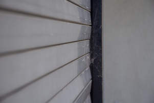 Line. ISO 400, Aperture f/8, Shutter Speed 1/250. Line. ISO 400, Aperture f/8, Shutter Speed 1/250. This picture was taken at one of the snack carts near the gym building. The lines of the metal covering leads the viewers eye to the spider web at the end of the line. It is successful because it guides the viewers eye to the spider web at the end of the cart. 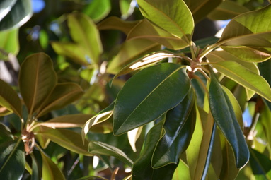 Color. ISO 400, Aperture f/8, Shutter Speed 1/320. Color. ISO 400, Aperture f/8, Shutter Speed 1/320. This photo is of a tree near the administration office. This shot captures the vibrant colors of the leaves. It is successful because it uses analogous colors to show the natural color. 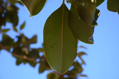 Shape. ISO 400, Aperture f/8, Shutter Speed 1/320. Shape. ISO 400, Aperture f/8, Shutter Speed 1/320. This photo was also taken of a leaf of a tree near the administration office. It shows the organic shape of the leaf, ultimately representing nature. It is successful because it shows viewers nature and the beauty of it. 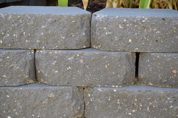 Form. ISO 400, Aperture f/8, Shutter Speed 1/100. Form. ISO 400, Aperture f/8, Shutter Speed 1/100. This photo was taken near our classroom. I decided to get this shot because it showed the height, width, and depth of these brick-like rocks. It is successful because it shows the three dimensional nature of the subject. 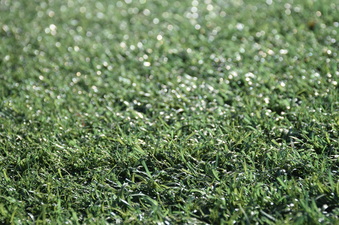 Texture. ISO 400, Aperture f/8, Shutter Speed 1/640. Texture. ISO 400, Aperture f/8, Shutter Speed 1/640. This photo was taken on the field of our school stadium. It shows the texture of the grass, allowing viewers to get a glimpse, or feel, of what the camera captured. It is successful because it allows viewers to feel as though they know what the fake grass feels like. 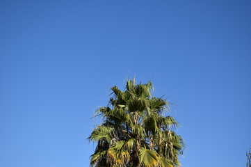 Space. ISO 400, Aperture f/8, Shutter Speed 1/1600. Space. ISO 400, Aperture f/8, Shutter Speed 1/1600. This photo was taken of a palm tree at our school. I like it because the tree is so evidently the main focus, with the empty, blue sky being the background, or the negative space. It is successful because it incorporates the negative space with the positive space to ensure the tree is the main subject. 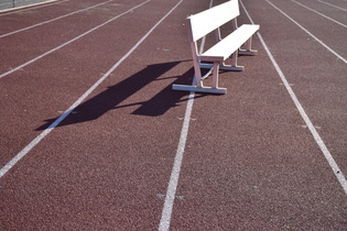 Value. ISO 400, Aperture f/8, Shutter Speed 1/1000. Value. ISO 400, Aperture f/8, Shutter Speed 1/1000. This photo represents value because it shows the shadow of the bench. I had no clue what to do for value so I shot the first thing I saw that had a shadow. It can be considered successful because it caught the shadow cast by the bench.
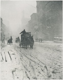 Alfred Steiglitz Winter, Fifth Avenue, 1982 Alfred Steiglitz Winter, Fifth Avenue, 1982
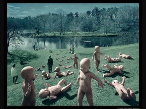 Sandy Skoglund, Babies at Paradise Pond, 1996 Sandy Skoglund, Babies at Paradise Pond, 1996
The use of color in this particular photo leads to the effect of the photo. Using analogous colors, blue and green, and darkening them, Skoglund created a gloomy effect. This is successful because it corresponds with the apparent chaos within the photo. 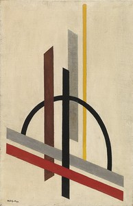 Laszlo Moholy-Nagy, Architecture (Eccentric Consrtuction), 1921 Laszlo Moholy-Nagy, Architecture (Eccentric Consrtuction), 1921
Shape is integrated in this photo using the same shape with vibrant colors to contrast the dark shades.The repetitive use of this shape, and a single different shape, makes this photo successful. 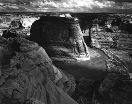 Ansel Adams, Moonrise Hernandez, 1941 Ansel Adams, Moonrise Hernandez, 1941 Form is three dimensional, has height and width and depth
 Travis Burke Travis Burke
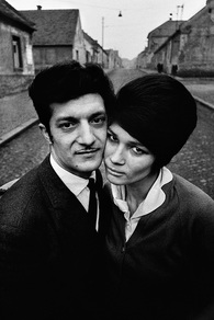 Josef Koudelka, Bohemia, 1966 Josef Koudelka, Bohemia, 1966
The main focus in this photo is the couple portrayed front and center. It is to be noticed that they are huddled tightly together, creating a larger area of positive space. Koudelka captured this positive space from a high angle in order to also capture the negative space, the background. The use and contrast of this positive and negative space makes this photo successful.  Benjamin Von Wong, Shark Shepard, 2015 Benjamin Von Wong, Shark Shepard, 2015
 Annie Leibovitz, Christo, 1981 Annie Leibovitz, Christo, 1981
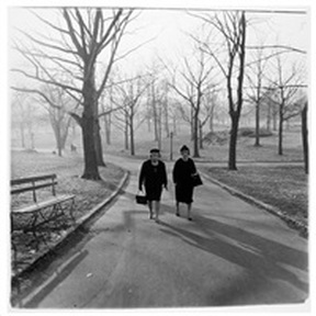 Diane Arbus, Two Ladies Walking in Central Park, 1963 Diane Arbus, Two Ladies Walking in Central Park, 1963
The proportion in this photo is the contrast in size between the main focal point of the picture and the background. The women are very small in this photo, while the trees are towering above them. Arbus' photo is successful because it portrays not only the contrast in size, but a bigger picture; man vs. nature. 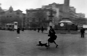 Ropert Capa, Barcelona, 1936 Ropert Capa, Barcelona, 1936
Rhythm is used in this photo to emphasize city life. The buildings in the background look similar, with few distractions from the main focal point, the person running with their dog. What makes this successful is despite the many things occurring in the photo, The main focal point is still the person and their pet. 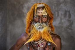 Steve McCurry, INDIA, 2010 Steve McCurry, INDIA, 2010
 Joel Meyerowitz, Times Square, New York, 1965 Joel Meyerowitz, Times Square, New York, 1965
 William Wegman, Walk-a-thon, 2012 William Wegman, Walk-a-thon, 2012
Many elements were integrated in this photo. For example, color is used to add vibrancy. Texture is used with the dog's fur. The use of these many elements makes for a successful photo. 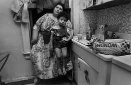
Unity is used in this photo to portray the love between a mother and her child. The messy kitchen, the cluttered environment, and the raggedy clothing create almost a cozy feeling, which leads to unity. This essentially creates a successful photo.
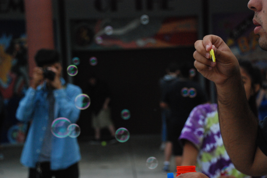
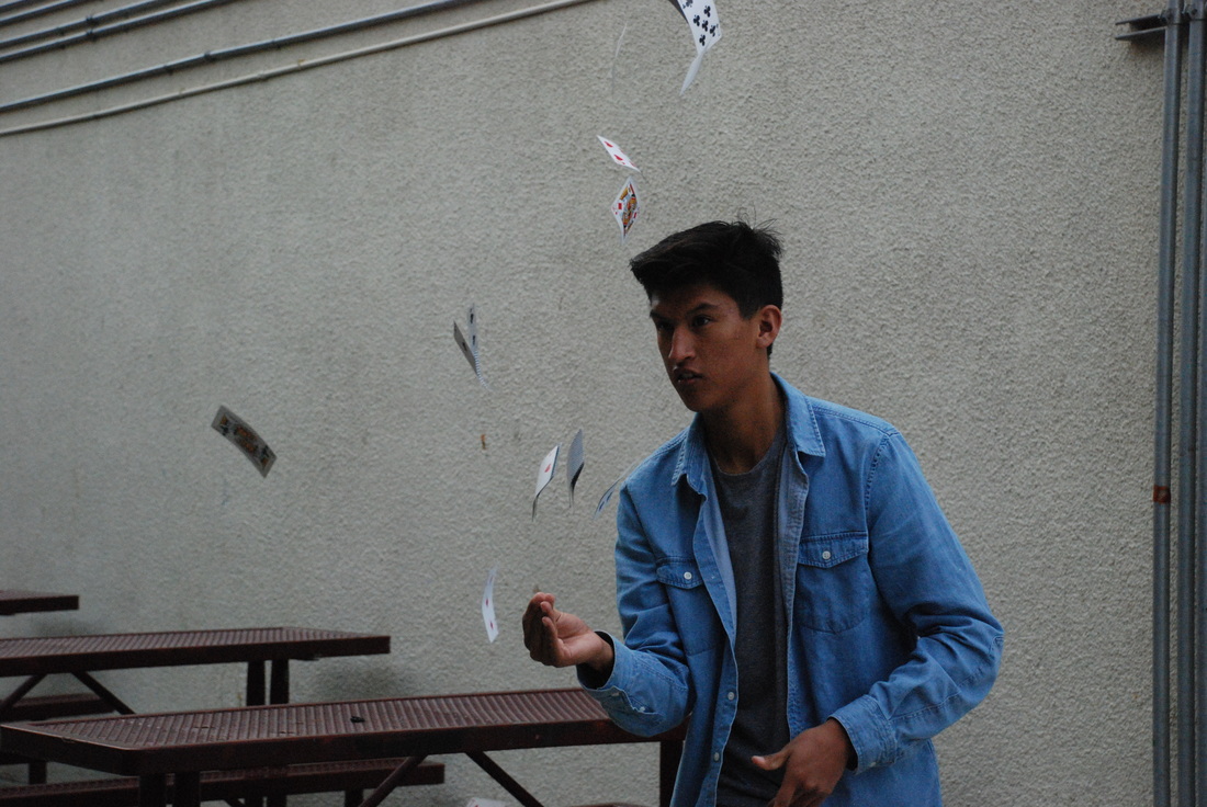
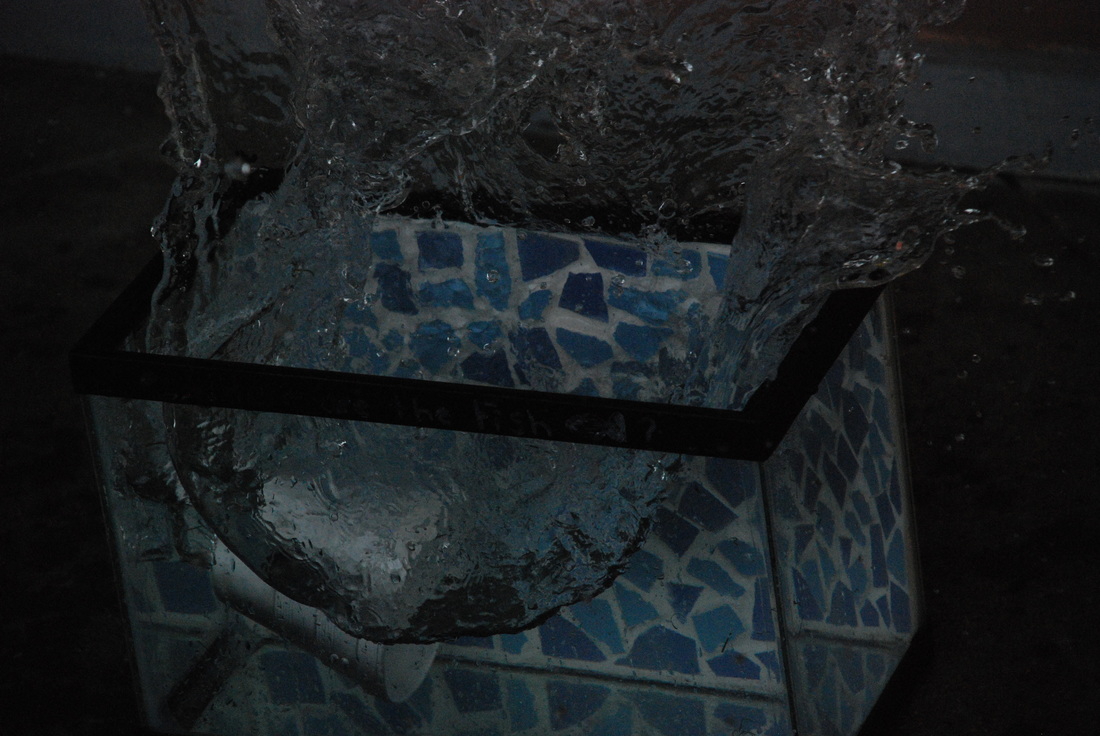
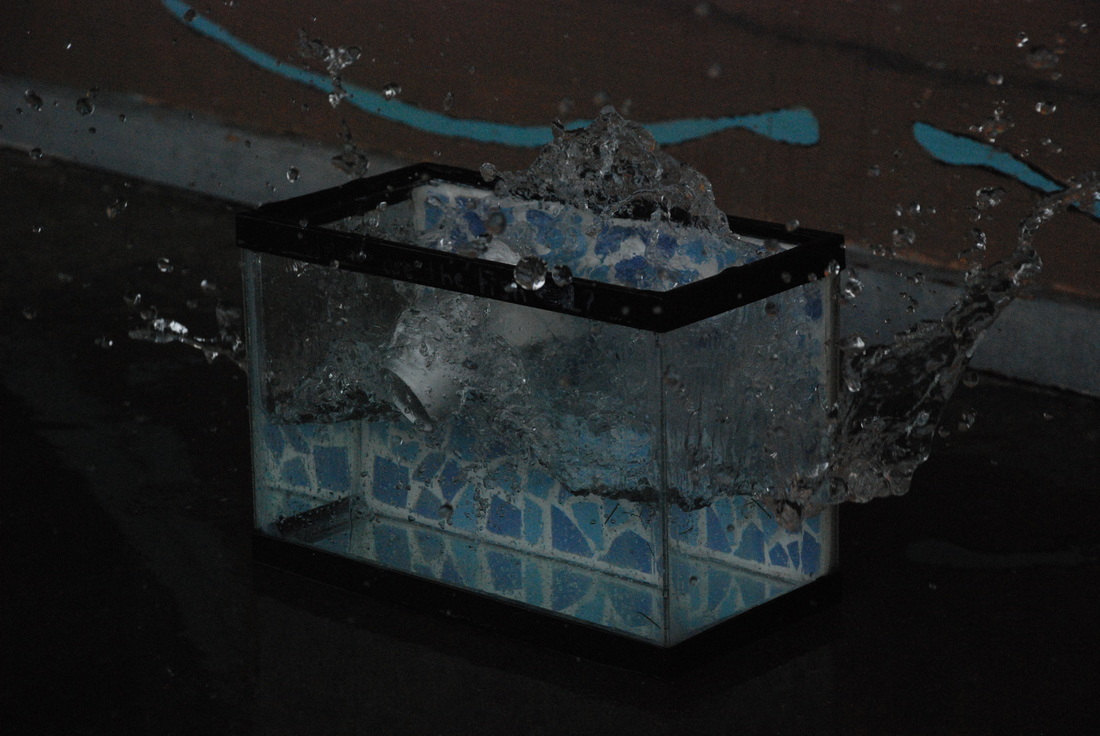
 ISO 1600, Shutter Speed 1/1000th of a second, Aperture f/4.8 These photos were taken using a fast shutter speed. One struggle I came across when taking these photos was that the photos would come out dark and grainy, even without zoom. Using shutter speed taught me a lot of things; you have to be precise with your timing, you should take advantage of your zoom and focus options, and that you can take lots of photos using fast shutter speed that you wouldn't be able to catch with a normal shutter speed. You could use fast shutter speed for many things, such as swimmers, animals, cars, sports, and much more.
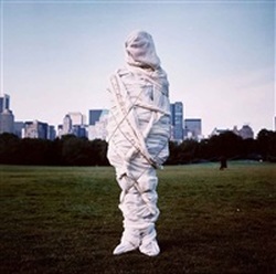
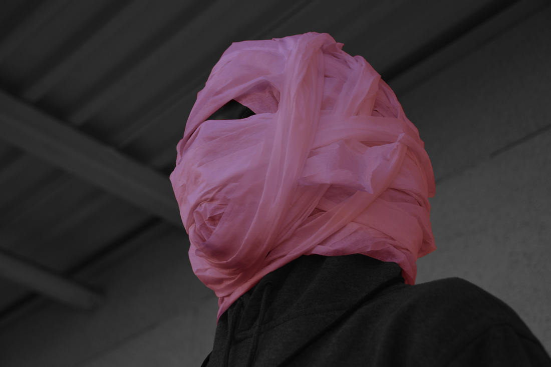 "Don't Get Wrapped Up In Drugs" ISO 1600, Apeture f/4.5, Shutter Speed 1/800th of a second. This photo is entitled “Don’t Get Wrapped Up in Drugs.” This applies to the theme of respect because the photo is telling viewers to respect their bodies by not getting involved with drugs. I then took it at a lower angle to catch my partner’s outward glare. This created a sad, regretful effect. To create this photo, I wrapped my partner’s head in fabric to represent the zombie-like effect drugs have on one. His regretful glare was to emphasize the regret of getting involved with drugs. I captured the glare at an angle in order to capture his eyes to show readers that under the wrapped fabric, which represents the drugs overtaking your body, there is a human. This photo is a way to persuade viewers to avoid peer pressure. Red Ribbon Week is the fight against peer pressure, violence, alcohol, and drugs in general. The red on the photo symbolizes awareness, which is shown through the idea of the Red Ribbon. This photo itself reflects on the idea of awareness and prevention, showing viewers what could happen if they got “wrapped up” in drugs.
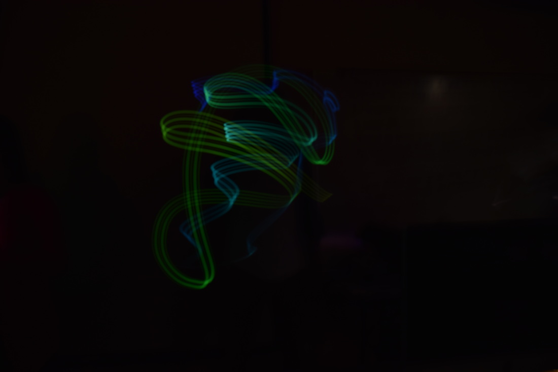
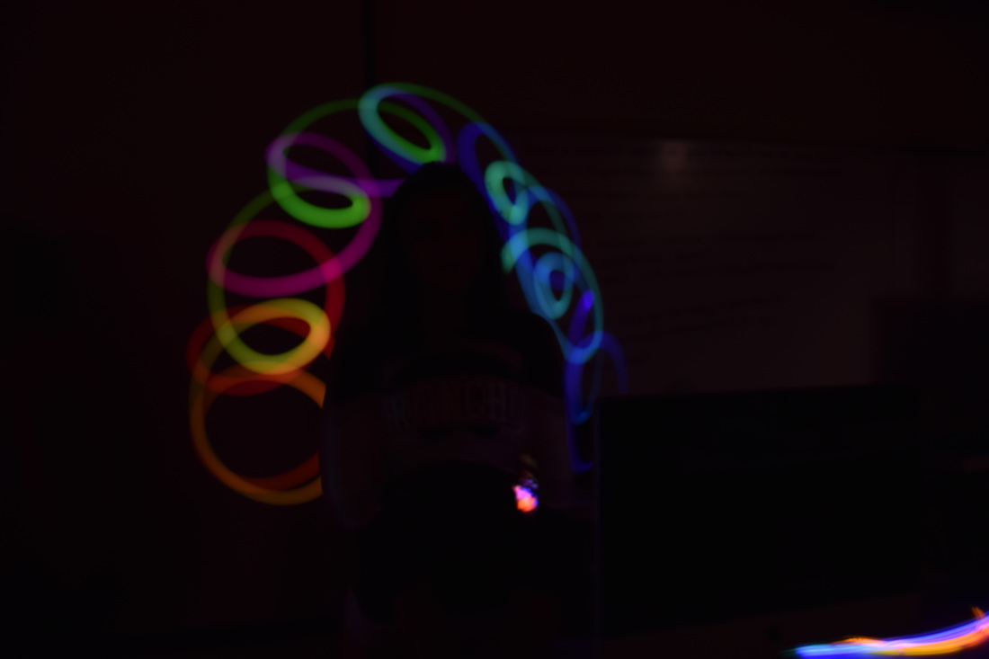
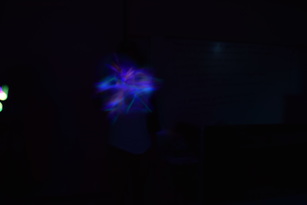
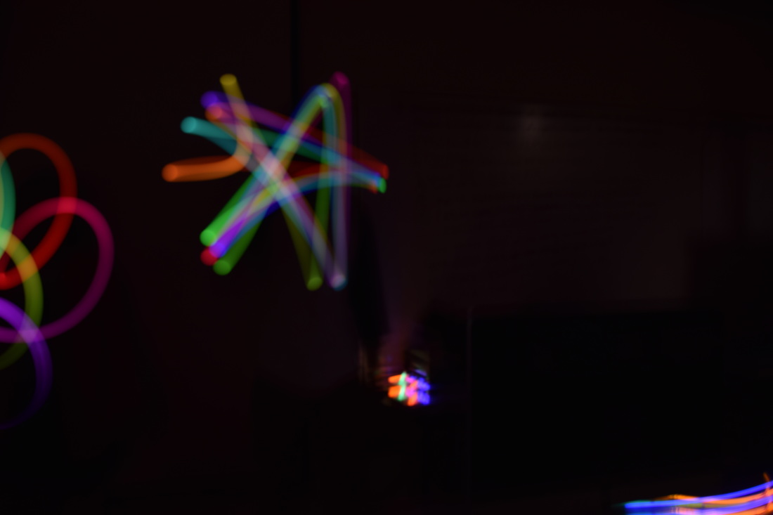
These photos were taken inside of our classroom on tripods. The room was completely dark in order for the light painting effect to work. Students brought in glow sticks and others got apps on their phones. The app that my partners used was MyLight Paint, and we used some glow sticks that our teacher provided for us, too. During this experiment, my partners and I had trouble creating photos with words. The photos came out really weird- the letters were really close, overlapping, or illegible. Also, with thinner glow sticks, the light painting would come out either very faint or too thin to create something.
|
AuthorAngel Estrada, photography student in San Diego, California Archives
June 2017
Categories |


 RSS Feed
